|
FIRST CONTACT (Tuesday via text):
SARAH Hi Dwayne - hope all is good with you? I wondered if you were still up for editorial illustration - the saturated dark style in your archives like you did for me before? I have a very dark piece I'm seeking to illustrate this week - deadline Friday morning. Might you be interested? Let me know, thanks! Sarah (Guardian) Dwayne Hi Sarah, great to hear from you (and quite a surprise). I've actually just begun my annual leave for a couple of weeks - however, you've peaked my interest. Would it be possible for you to give me some more details about the article and your ideas so that I can consider how much time it might take? It's always great to work with you, so if I can make it happen without eating up my holiday, I will. Sarah Thanks Dwayne! I'll send you over an email now with outline of the idea plus details. |
Article was received along with details:
1 print illustration. Size initially undecided but likely to be within 218 by 175 range. To be printed full colour on newsprint. 1 spot/vignette print illustration. Small, undesignated size but to be used within type (article quite long). 1 online illustration to be derived from print piece but with a letterbox format (worth being mindful of this whilst planning print piece). Article received Tuesday afternoon. The following thumbnails sent Wednesday morning. Usually would try to turn this around within an hour or two but I was on my holidays ;) |

|

|
Idea 01
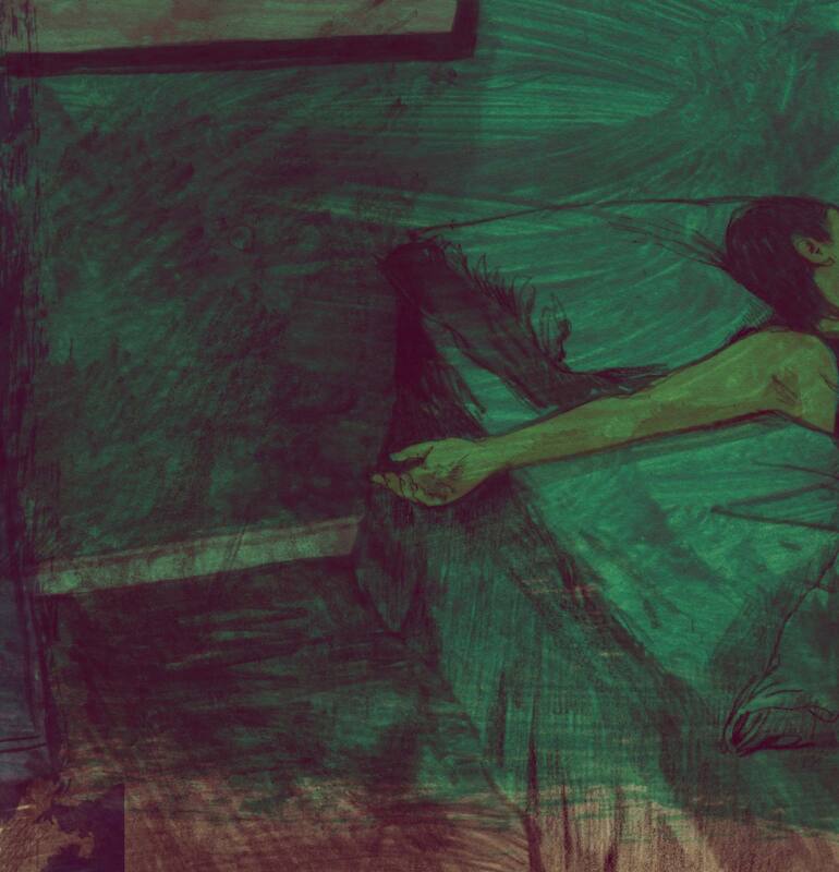
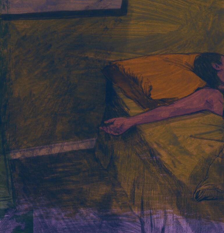
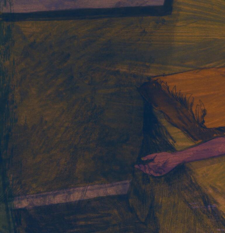
Domestic scene. There is where I was thinking about the 'normalised' aspect of the article. My thoughts are to use a Bernie Fuchs-esque composition (good for creating a sense of unease/something being wrong) to show a predominantly 'normal' domestic scene. The woman's hand is limp and hangs from the edge of the bed - along with ruffled sheets or other such details, this might be the only evidence of something amiss (mirroring the idea that this issue is too easily being avoided & brushed off etc). In the second rough, the man's aggressive, tensed hand contrasts and is shown in shadow or silhouette. It's the second of the two which I prefer. Simpler, less elements; the two contrasting hands telling the story.
Domestic scene. There is where I was thinking about the 'normalised' aspect of the article. My thoughts are to use a Bernie Fuchs-esque composition (good for creating a sense of unease/something being wrong) to show a predominantly 'normal' domestic scene. The woman's hand is limp and hangs from the edge of the bed - along with ruffled sheets or other such details, this might be the only evidence of something amiss (mirroring the idea that this issue is too easily being avoided & brushed off etc). In the second rough, the man's aggressive, tensed hand contrasts and is shown in shadow or silhouette. It's the second of the two which I prefer. Simpler, less elements; the two contrasting hands telling the story.

|

|
Idea 02
This was prompted by your last message. I very much like the simplicity and directness as well as the slightly enigmatic nature of the hand gesture - it could be caring, it could cross the line into aggressive. As you say, the tone could be set by bold, dark mark making (very much suited to the mid-century approaches which I favour) and cold/dark colour. I think I'd keep the composition cropped quite tight - allows us to focus on the hand and also serves to keep the female character from being specific.
This was prompted by your last message. I very much like the simplicity and directness as well as the slightly enigmatic nature of the hand gesture - it could be caring, it could cross the line into aggressive. As you say, the tone could be set by bold, dark mark making (very much suited to the mid-century approaches which I favour) and cold/dark colour. I think I'd keep the composition cropped quite tight - allows us to focus on the hand and also serves to keep the female character from being specific.
PROOFS

01
Hand being turned up seems less 'death like' than the alternative, where the woman is lying on her front with her hands palm down. It's also easier to show some amount of conscious tension in the fingers from this aspect.
|

02
|
03
Male hand to be added to the foreground, I think silhouette rather than shadow, as if we're behind the man, looking past his hand. Colour and tone is a movable feast at this stage, I want to go dark and murky but obviously not to the point of loosing points of focus. Once the foreground element is in place, it will become easier to make those decisions.
|
04
|
05
|

06
|
FINAL PROPOSALS

FINAL (A)
In my opinion, flipping the image makes for a better composition. Let me know your thoughts regarding tone. As you mention, newsprint's tendency to darken colours and group tonal ranges. Some adjustment of levels etc might be needed? |

FINAL (B)
Whilst working on the image, I stumbled across this option and thought I'd present it here. It's a piece that asks more questions than it answers - which I consider a strength. The composition and singular focus are unsettling - much like the subject of the piece. Again, if you're interested in this illustration, I expect some tonal adjustments to be needed, your guidance and experience of working with newsprint is appreciated. |
SPOT

Spot 01
Had nothing left over from the making of the main piece and in the interest of continued simplicity - and of hands being the focal point - I thought a single hand might work. If you have other ideas for the spot, let me know.
Did consider some sort of visual reference to porn & women's magazines but that starts to become a lot to say in a small piece - and flies in the face of our attempts at simplicity. |
PUBLISH
Print

|
Web

|
Spot

|
