|
JOE & BETH KRUSH
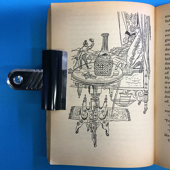
Joe and Beth Krush were an American, husband and wife illustration team who's work I stumbled across during the course of this module. Their confident use of and almost complete reliance on line to create a complex and playful image was very attractive to me. In the early stages of producing my own work for this module, I found myself ruminating over the use of tone, mark making and colour in my work and how I might utilize those elements in these pieces. My natural tendency is to work completely in line. Granted, this can produce an almost paternistic illustration that can require some translation from the viewer but I've never found that to be an issue. When I saw the Krushes work I saw that disregard for tone and absolute reliance on line, in the flesh. This give me the confidence to recognise that approach as viable. There's a natural / taught tendency to assume colour or tone is a must and that the lack of these elements must signify incomplete work. The Krushs work reminded me that this is not the case. As well as the strong use of line, the Krushs rely on bold and confident use of composition to create almost abstract vignettes, often including unexpected and playful angles and viewpoints - things to consider. This copy of Mary Norton's The Borrowers was bought from ex library stock from America. |

|


|

|

